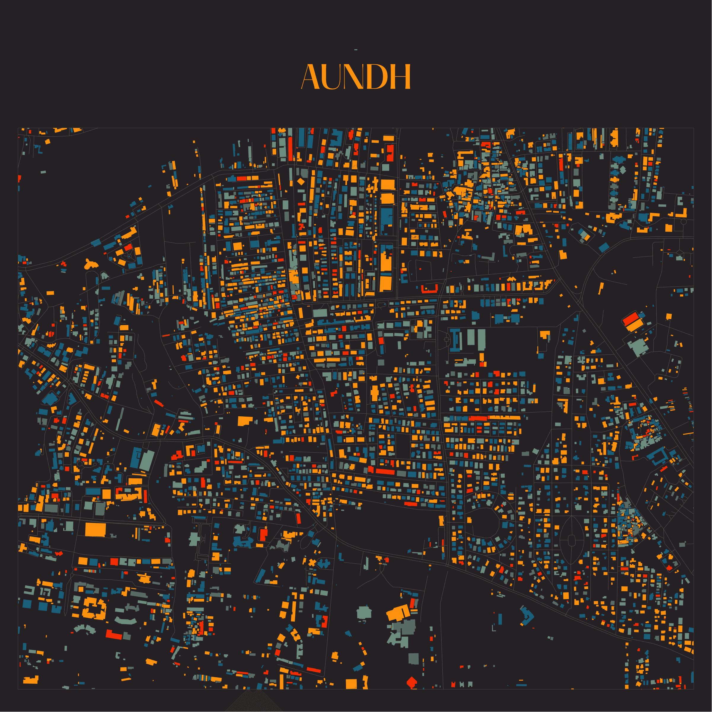
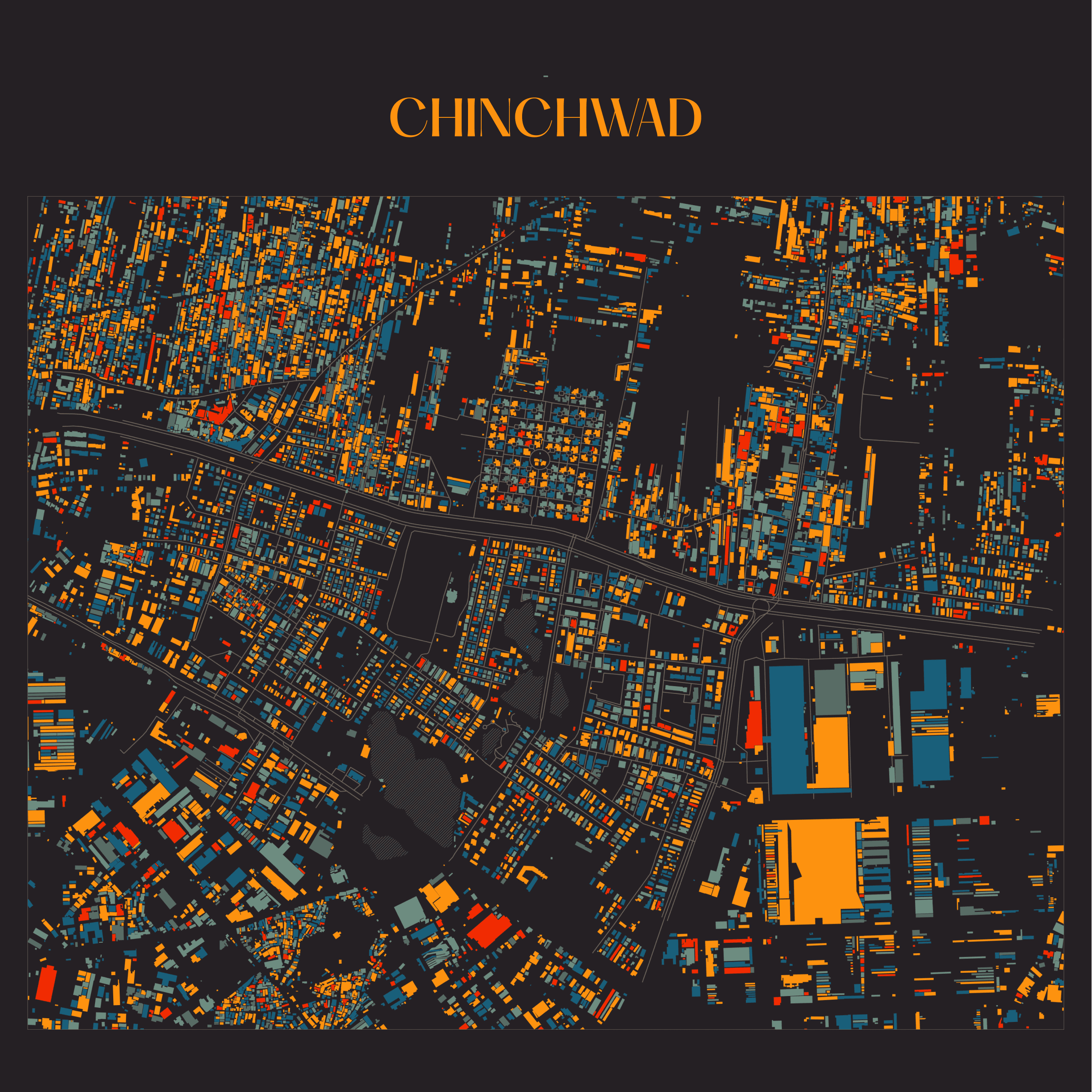
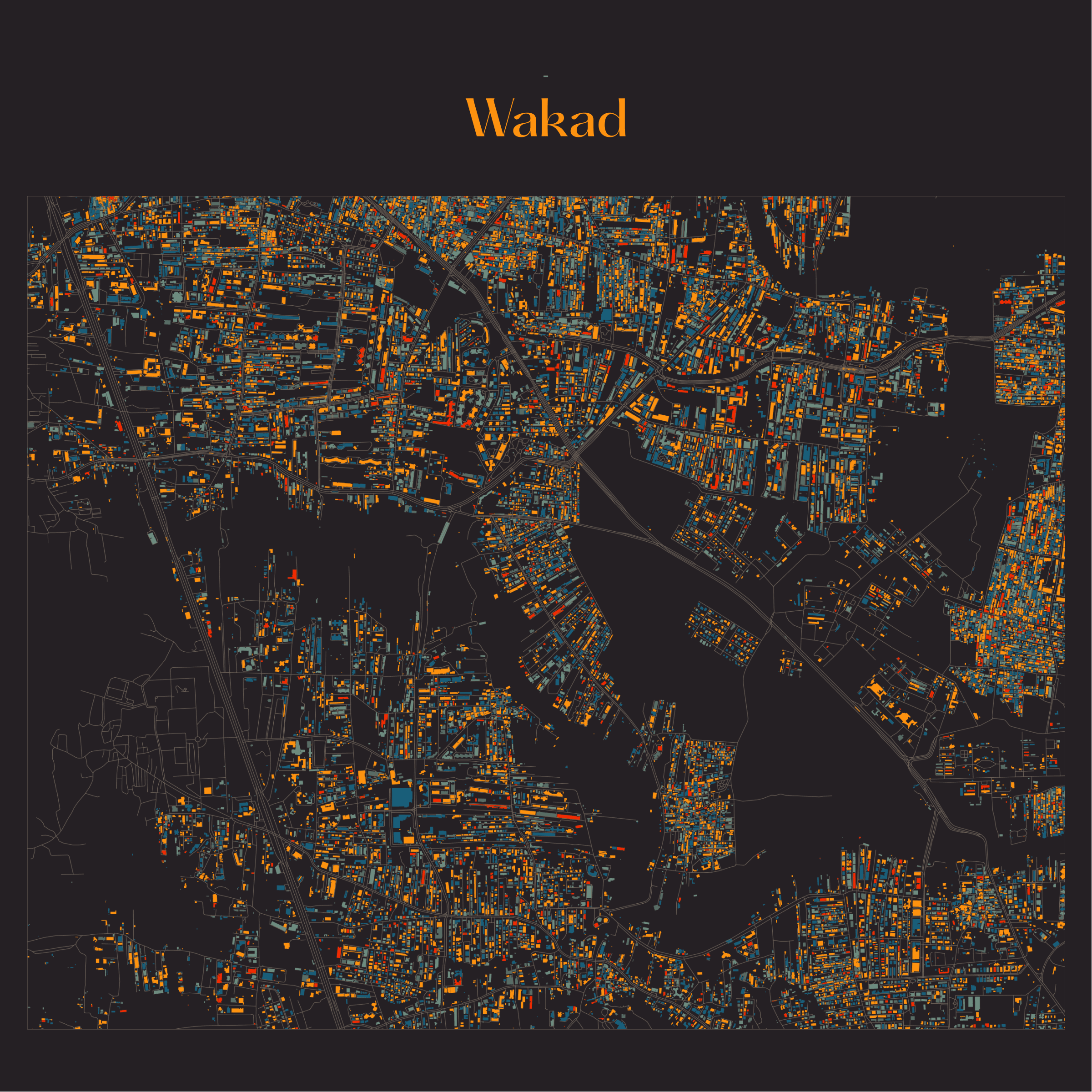
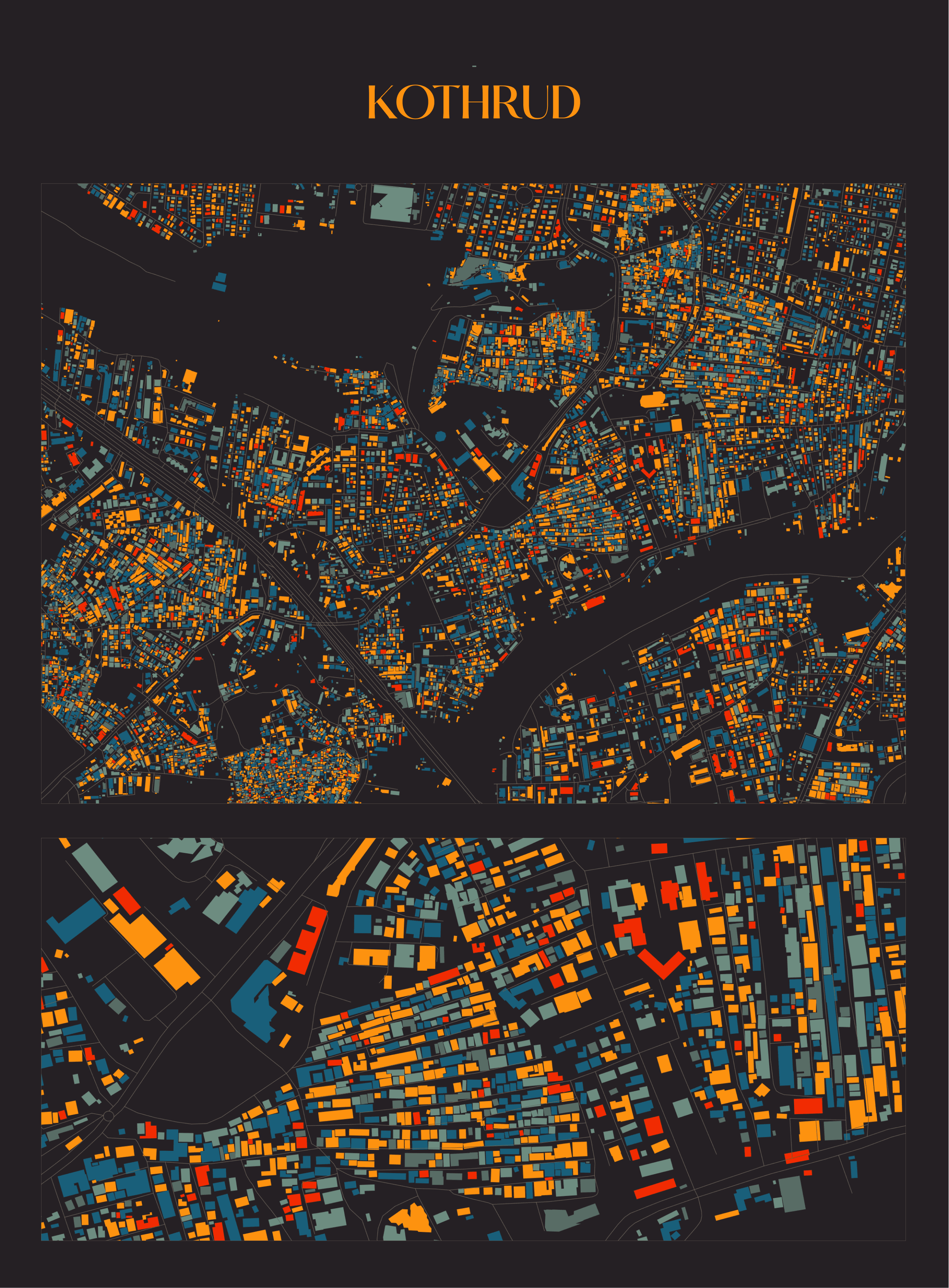
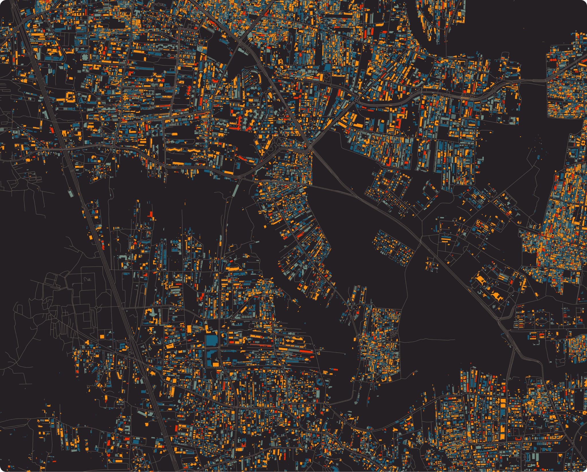
Creating pretty maps for fun (and learn) !
I came across this twitter post on a boring weekend, the turn of events after that was something I was not expecting.
It is safe to say that I was always interested in data visualization, but I never actually worked on anything substantial in the past. The only chance I ever got to visualize something from real data was in a 3D project where I used OSM to create giant plane of my town and failed terribly and another was in pitch decks :D
Here I will walk you through my process of visualizing and creating these cool artworks from real life data for the first time with QGIS . The full breakdown and tutorial for the same is given by the author on his blog.
What is QGIS?
QGIS allows you to work with geographical data. It allows you to analyze and visualize various types of geographical information, such as maps, satellite images, and location-based data, making it easier to understand and utilize in a variety of professional contexts.
What dataset was used to create this?
Process
Once the desired data was extracted in GeoJSON it was time to import it in QGIS.
It took me a almost 2 days to understand and learn basic features of QGIS and then I started adding properties that I wanted to visualize.
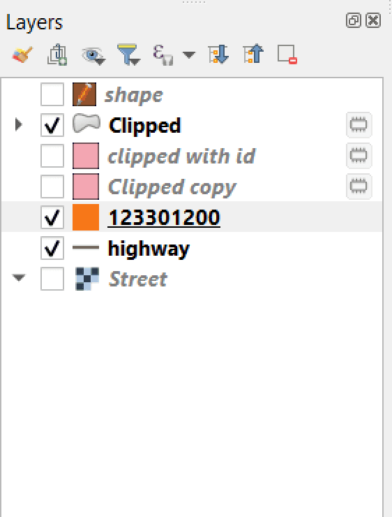
I clipped the area I wanted in the first layer. With some additional properties like enabling highways, I added a simple background to it. And moved on to styling the visualisation
Exploring the style
It is important for any visualization project to have a great aesthetic, so I started gathering some inspiration and creating a moodboard for the same.
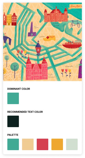
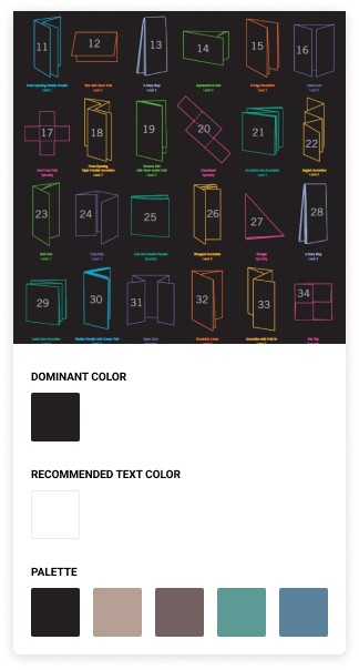
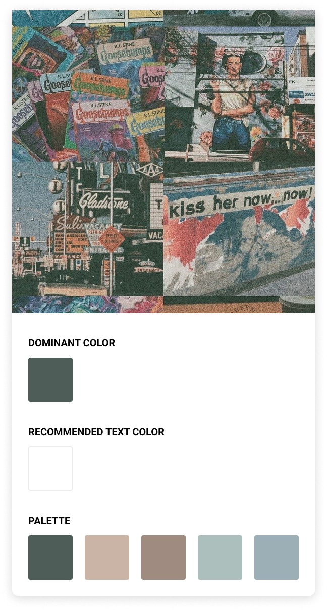
After a lot of back and forth, I went with the same style as the author of original post, but in a dark mode.
